


Hexagonal maps, commonly known as hex or hex-tile maps, provide an innovative and attractive way to present data in dashboards using Business Intelligence (BI) tools. This visualization technique has gained popularity due to its specific advantages for data analysis. Unlike traditional map projections, hex maps employ a uniform grid of hexagons, creating a more equitable representation of data. Each country is depicted by an equally sized hexagon, making the map easier to read and directing the viewer’s attention to the data displayed rather than geographical differences. Moreover, the hexagonal format excels in illustrating patterns and trends, revealing insights that might be hidden in conventional maps.
Therefore, hex maps can be a valuable asset for businesses, as they simplify global comparisons and improve decision-making by offering a clearer, more accessible view of key data.
Creating a More Realistic World Hex Map: My Custom Approach
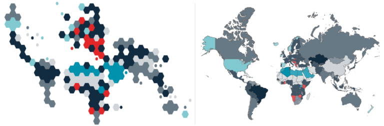
I’ve often seen hex-tile representations of the United States and some hex-tile world maps on Tableau Public. While I really like how the United States are often tiled into hexagons, I felt that many of the world maps didn’t closely enough resemble a traditional world map. Therefore, I created a Tableau dashboard, featuring my own version of a world hex map that color-codes countries by their most and second most popular languages to learn. This hex map includes two key modifications: smaller islands are shown with smaller hexagons, while the ten largest countries are represented by four hexagons each. These adjustments provide a more nuanced depiction of country sizes and enhance the overall visual contours of the continents.
I love it!
But before you dive into it, let’s explore the advantages of hex maps – focusing specifically on world hex maps – while also considering their disadvantages.
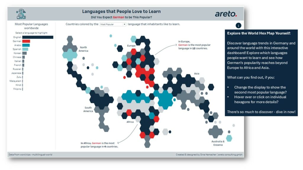
see the full map with an interactive dashboard here
Advantages of Hexagonal World Maps in Dashboards
-
Balanced Perspective
World hex maps remove the distortions common in traditional projections and prevent large countries from dominating smaller ones by providing each country with equal space. This ensures that countries like Canada don’t appear disproportionately large, while allowing smaller nations to become more visible. This way, hex maps make it easier for users to focus on the data being presented. -
Interactive User Guidance
Another advantage is the hex maps suitability for interactive elements. The uniform shape and size of the hexagons make it easier to add tooltips, filter options, and dynamic information that appears when hovering over or clicking on a country. This allows users to dive deeper into the data and focus on specific countries to obtain additional information. -
Engaging and Modern Aesthetic
In addition to their functional advantages, hexagonal maps provide a modern and visually appealing method of visualization. A dashboard featuring hexagonal world maps offers a distinctive and fresh visual experience, making it a striking alternative to traditional mapping methods. -
Optimized Performance
Since hexagonal maps aggregate data into uniform hexagons, fewer geometric elements typically need to be displayed on the screen, resulting in quicker rendering times. This efficiency allows users to gain insights more rapidly and effectively.
Disadvantages of Hexagonal World Maps in Dashboards
- Implementation Challenges
Hexagonal maps often require more effort in their creation and implementation. While many BI tools provide geographic maps by default, hexagonal maps usually necessitate additional customizations or specialized add-ons. One significant challenge is determining the placement of countries within the hexagonal grid. - Loss of Geographical Accuracy
Traditional maps provide a more accurate representation of the geographical reality. Therefore, hex maps are not ideal when precise borders, geographic features, or true country sizes are essential.
Future Trends and Innovations
As hexagonal maps gain traction, we can expect even more innovations in their application. With advancements in AI and machine learning, hex maps could become even more interactive and responsive, allowing users to explore complex datasets in real-time. Additionally, with the growing focus on spatial data and geographic insights, hexagonal maps may become a key tool for industries like urban planning, climate change analysis, and even global health tracking. As these technologies evolve, the potential for hexagonal maps to revolutionize data visualization continues to grow.
Ready to Take Your Data Analysis to the Next Level with Hex Maps?
Do you think that hexagonal maps would make your data clearer and more engaging? Then read this article on How to use hex-tile maps to eliminate the Alaska effect as an example on how to create a hex map in Tableau and get startet!
If you have questions about the implementation or need assistance designing a dashboard with hexagonal maps, we’re here to help. Our team supports you every step of the way to make your dashboards modern, clear, and impactful! Schedule an appointment with one of our experts HERE.