


In the realm of data visualization and analytics, Tableau is a powerhouse tool that enables users to transform their data into meaningful insights with stunning visualizations. However, the true magic lies not just in the visuals, but also in the statistical functions that feed them. Statistics, combined with Tableau’s intuitive interface, empower users to better understand their data, find hidden trends, which can lead to more informed decision-making. In this blog post, we will explore 3 essential statistical functions you can use in Tableau – Histograms, Standard Deviation, and Box Plots – and how to leverage them to enhance your business dashboards.
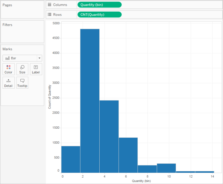
1. Histograms:
Histograms are a powerful visualization that help to understand the distribution of the measures in your dataset.
In Tableau, creating a histogram is a simple: Simply right-click on a measure, navigate to the Create menu, and select ‘Bins’. Tableau will automatically group the data into bins, displaying the frequency of values within each bin.
By visualizing the distribution of data, histograms provide valuable insights into patterns, outliers, and the overall shape of the dataset. Utilize histograms in your Tableau dashboards to gain a deeper understanding of your data’s underlying characteristics and identify areas for further
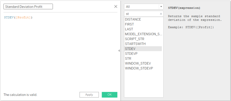
2. Standard Deviation:
Standard deviation is a fundamental measure to quantify the spread of data points around the mean. In Tableau, calculating standard deviation is straightforward. By changing the aggregation of a measure, users can select either the population or sample standard deviation. Tableau’s built-in aggregation options make it easy to compute standard deviation and visualize the variability within your data. Incorporating standard deviation into your Tableau dashboards provides valuable context, allowing stakeholders to assess the consistency and reliability of data points, identify outliers, and make informed decisions based on data variance. For more info, click here.
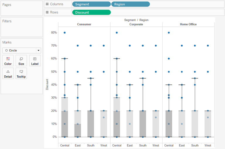
3. Box Plots:
Box plots, also known as box-and-whisker plots, offer a visual representation of the distribution and variability of data. In Tableau, creating a box plot works seamlessly. Simply organize your dimensions and measures on the Rows and Columns shelves, then select the box plot chart type from the ‘Show Me’ menu. Box plots display key statistics such as median, quartiles, and outliers, to provide a concise summary of the data’s distribution. By incorporating box plots into your Tableau dashboards, you can easily compare distributions across different categories, identify trends, and spot anomalies that require further investigation. For more info, click here.
Bonus – Integrating R and Python:
By harnessing the power of statistical functions in Tableau – such as histograms, standard deviation, and box plots – users can unlock deeper insights, drive data-driven decision-making, and elevate the effectiveness of their business dashboards. The combination of Tableau’s intuitive interface and its robust statistical capabilities makes possibilities for data exploration and visualization limitless.
Tableau Statistics with areto:
At areto we possess the expertise and experience to provide customized advanced analytics solutions with Tableau for our customers, including R and TabPy to enable a variety of advanced analytics capabilites. Our BI experts and consultants’ deep expertise and commitment, along with our solutions and best practices, might save you a significant amount of time.
Do you need support with Tableau topics? Book a quick support appointment with one of our Tableau experts HERE.